이번에 살펴볼 예제는 Interpolation에 관련된 예제입니다. 우리나라 말로 보간법, 또는 내삽이라고도 불리는 이것은 우리가 알고 있는 discrete한 sample들을 바탕으로 우리가 가지고 있지 않는 점의 값을 추정하는 방법입니다. 예를 들면,
이 그림과 마찬가지로, 가장 간단하게 두 점 사이의 값들을 추정하는 방법은 직선을 그어서 그 값을 활용하는 방법입니다. 그러면 어떻게 Python을 활용하여 이 값들을 추정하는지 알아봅시다.
먼저, 1차원 값을 추정할 때에는 scipy.interpolate에 있는 interp1d를 import해주어야 합니다.
>>> import numpy as np
>>> from scipy.interpolate import interp1d
다음으로 $\cos x$함수를 0부터 $\pi/2$의 간격으로 20개의 샘플을 만들어줍니다.
>>> x = np.linspace(0, 10*np.pi, 20)
>>> y = np.cos(x)
다음으로 2개의 interpolate 함수들을 만들텐데, 하나는 linear방식으로 보정할 것이고, 다른 하나는 quadratic방식으로 보정할 것입니다. 고로 quadratic방식을 활용한 방법이 훨씬 더 부드럽게 보정되겠죠?
>>> fl = interp1d(x, y, kind='linear')
>>> fq = interp1d(x, y, kind='quadratic')

## 만들어진 함수가 어떤 type의 변수인지 확인합니다.
>>> type(fl)
scipy.interpolate.interpolate.interp1d
만들어진 함수를 보면 단순한 값이 아니라 어떤 구조를 갖는 것을 알 수 있죠? 여기에 우리는 새로운 $x$값들, 즉 보정값을 찾을 $x$값들을 넣어야 보정된 $y$값을 얻을 수 있게 됩니다. 따라서 기존의 20개의 샘플이 아닌 같은 범위에 1000개로 미세하게 나눠진 구간을 어떻게 보정하는지 확인해 봅시다.
# 보정할 새로운 x값을 정의하고 아까 생성했던 interpolate함수로 보정합니다.
>>> xint = np.linspace(x.min(), x.max(), 1000)
>>> yintl = fl(xint)
>>> yintq = fq(xint)

# 그 결과 값을 그래프로 그려봅시다.
>>> %matplotlib inline
>>> import matplotlib.pyplot as plt
>>> plt.plot(xint, yintl, color='green', linewidth=2)
>>> plt.plot(xint, yintq, color='red', linewidth=2)
>>> plt.legend(['Linear', 'Quadratic'])
>>> plt.plot(x, y, 'o')
>>> plt.ylim(-1.5, 2)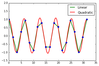
우리가 예상했던 대로 quadratic을 이용해 보정했을 때 훨씬 부드럽게 보정됨을 확인할 수 있죠?? 하지만 만약에 우리가 가지고 있는 데이터가 노이즈가 섞인 데이터라면 어떨까요? 앞서 배운 예제는 모든 점을 통과하기 때문에 자칫 잘못하면 노이즈에 의해서 보정 값들이 엉망이 될 수 있겠죠? 이를 보완하기 위해서 spline fitting을 사용합니다.
일단 spline-fitting을 위해서 scipy.interpolate에서 UnivariateSpline을 import합니다.
>>> from scipy.interpolate import UnivariateSpline이번에는 30개의 샘플을 약간의 노이즈를 섞어서 만들어주겠습니다.
>>> sample = 30 #data의 샘플 수
>>> x = np.linspace(1, 10*np.pi, sample)
>>> y = np.cos(x) + np.log10(x) + np.random.randn(sample) / 10
여기서 spline은 smoothing factor라는 인자를 필요로 하는데요, 이에 따라서 얼마나 샘플을 따라가게 fitting하느냐를 결정하게 됩니다. 참고로 $s=0$은 모든 샘플의 값을 통과하게끔 spline을 fitting하게 됩니다.(이전 예제들과 비슷하겠죠?)
# interpolate! s는 smoothing factor
>>> f0 = UnivariateSpline(x, y, s=0)
>>> f3 = UnivariateSpline(x, y, s=3)

>>> xint = np.linspace(x.min(), x.max(), 1000)
>>> yint0 = f0(xint)
>>> yint3 = f3(xint)

>>> plt.plot(xint, np.cos(xint) + np.log10(xint), color='black')
>>> plt.plot(xint, yint0, linewidth=2)
>>> plt.plot(xint, yint3, color='red', linewidth=2)
>>> plt.legend(['Original', 's=0', 's=3'], loc=2)
>>> plt.plot(x, y, 'o', color='black')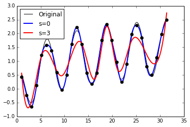
그래프를 통해 아시겠지만, s가 크게 되면 샘플에 좀 더 less dependent하다는 것을 아시겠지요?? :)